
Have you heard the common legend that scientists have proven that bumblebees, in terms of aerodynamics, can’t fly? This is a myth that came about because about eighty years ago an aerodynamicist made this statement based on an assumption that the bees’ wings were a smooth plane. It was reported by the media before the aerodynamicist actually looked at the wing under a microscope and found that the assumption was incorrect. While the scientist and the media issued retractions, the legend lives on.
Unfortunately, in the management world, decisions are made every day based on “legends” rather than on real evidence. At a manufacturing company I once worked for, it was a well-known “fact” that it was more profitable to discount prices to increase volume in a particular market. Even after a team of business managers proved discounting was a money loser, certain sales managers continued to rigorously advocate for the discount strategy for years. I like to refer to any ongoing argument like this as the “Fight” of the Bumblebee. This fight is the most difficult when the bumblebee argument is emotionally compelling (they’re not supposed to be able to fly!) and the truth is difficult to convey (bumblebees’ wings encounter dynamic stall in every oscillation cycle, whatever that means). Everyone loves a discount and can see pallets of product going out the door. Not everyone understands some of the indirect nuances that contribute to profit.
Winning the fight of the bumblebee is dependent on making sure that you are interpreting, visualizing, and reporting performance information in a meaningful way. People have to be trained to appreciate the difference between gut instinct and data-driven decision making. Once they see analysis done well a couple of times, they will start asking for it.
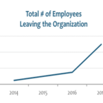
The key to interpreting a measurement is comparison. And the trick is to display the information in a way that effectively answers the question, Compared to what? Visualizing performance over time identifies trends that show data direction and development and provide context for the underlying story relative to strategy. The simplest and most effective way I’ve seen for consistently visualizing data is with a Smart Chart (or XmR chart), a tool showing the natural variation in performance data.
Once you have a better idea of how to interpret your data, reporting the information in a way that is meaningful is important. Reports should always be structured around strategy, so that people have the right context to understand what the data is about. Reports should answer basic questions you need to know, such as what is our current level of performance?, why are we getting that result?, and what are we going to do next?
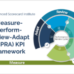
For more about how to interpret, visualize and report performance, see The Institute Way: Simplify Strategic Planning and Management with the Balanced Scorecard.

David Wilsey is the Chief Executive Officer with the Balanced Scorecard Institute and co-author of The Institute Way: Simplify Strategic Planning and Management with the Balanced Scorecard.
- David Wilsey
- David Wilsey

- David Wilsey

- David Wilsey

- David Wilsey
- David Wilsey
- David Wilsey

- David Wilsey

- David Wilsey

- David Wilsey

- David Wilsey

- David Wilsey

- David Wilsey

- David Wilsey

- David Wilsey
- David Wilsey

- David Wilsey

- David Wilsey

- David Wilsey

- David Wilsey

- David Wilsey

- David Wilsey
- David Wilsey

- David Wilsey

- David Wilsey

- David Wilsey

- David Wilsey

- David Wilsey